Role:
UX/UI - Design
Google Professional Certificate Project
Duration:
2023 - 6 Weeks
Tools:
Figma, Adobe Illustrator, Stable Diffusion, Blender
Challenge
The challenge was to create an app that would help with habit development. There are many apps that try to do this with very individual approaches. One thing was clear from the beginning - the competition is very strong. The goal was to develop an app that on the one hand responds to the needs of the user, but on the other hand should also consider the science of habit development.
Solution
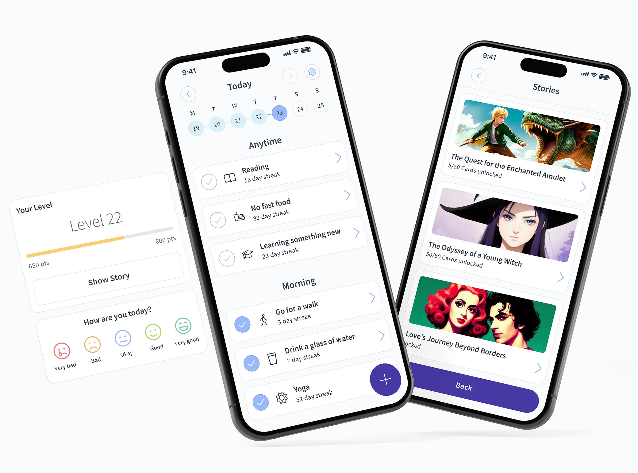
The result is an easy-to-use app that responds to the user's needs and makes use of scientific knowledge. Habit creation is made as easy as possible and is supported by a catalogue of ready-made habits the user can adopt and follow. The ability to create routines supports habit development. It was also important to me to include a mood tracker, so that the user can see how much the habits they have created are having a positive impact on their life.
Another important point in the development was to integrate a certain amount of gamification. This is supported by a storytelling element that unlocks more and more over time and rewards the user for sticking with it.
Show PrototypeMy Role
I served as the product designer and managed every aspect of the design process independently. This project was the final step in the third and final phase of Google's professional certification program. I completed the design journey without the benefit of a dedicated team to collaboratively engage in the design thinking process.
Design Thinking

1. Empathize
In this project, this empathizing phase was extremely important and intensive. It was very important for me to understand the needs of the users and back these up with scientific evidence. This type of app has a very high dropout rate and if it fails, the app is quickly abandoned. It is not easy to change habits and develop new ones. So, this was one of, if not the most, important aspect of the app's development.
Foundational Research
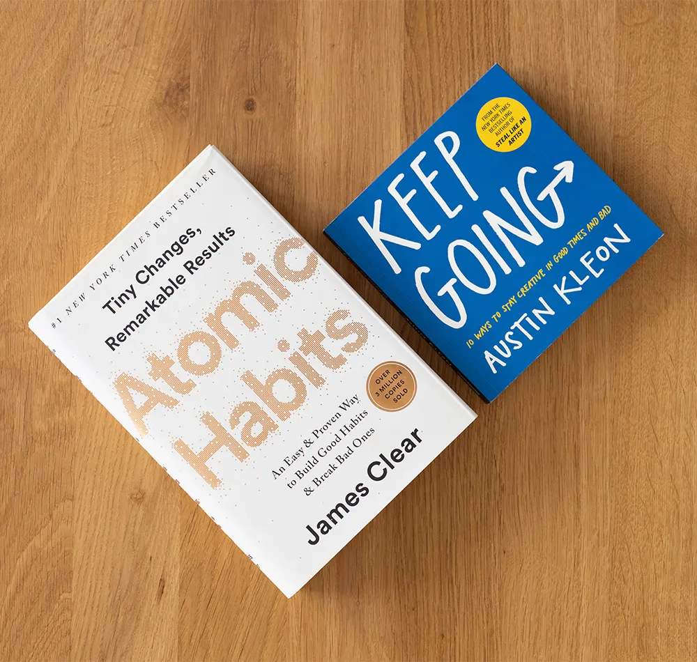
In addition to researching scientific studies, the following two books helped me gain a deeper understanding of how to create new habits. James Clear has published a very readable work that puts the scientific findings of habit formation into a simple framework. I found the topics of "Habit Stacking" and "Goals vs. System" particularly interesting for my project. These two points played a very important role in my design process. I will discuss this in-depth later.
Interview
It was very important to me to get as much information as possible. That is why I went through the effort of supplementing the qualitative surveys (6 participants) with a quantitative survey (21 participants). The questions of the two surveys were not the same but were adapted to the framework of the surveys.
The insights were very exciting. A large majority of users want to learn new habits, and many want to break bad habits. The majority had experience with habit tracking apps, but only a few were successful. It was particularly exciting to see that a large majority play smartphone or computer games on a regular basis. Gamification should definitely be part of the app.
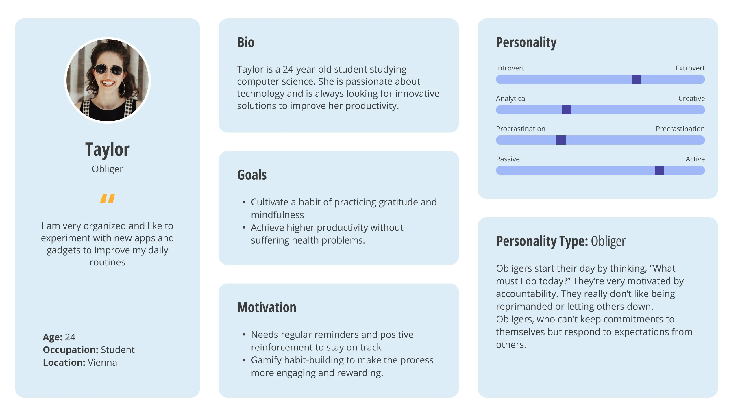
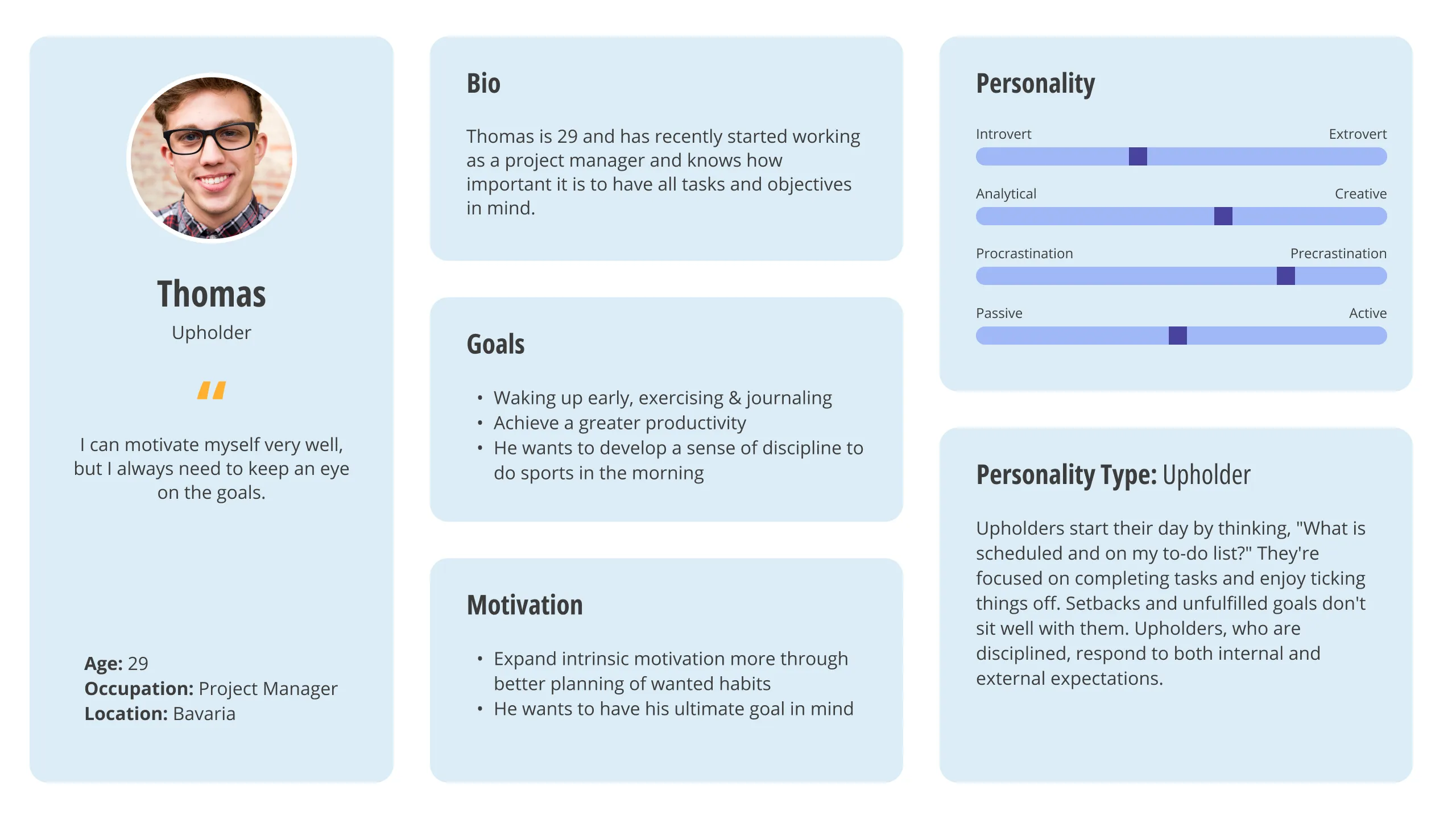
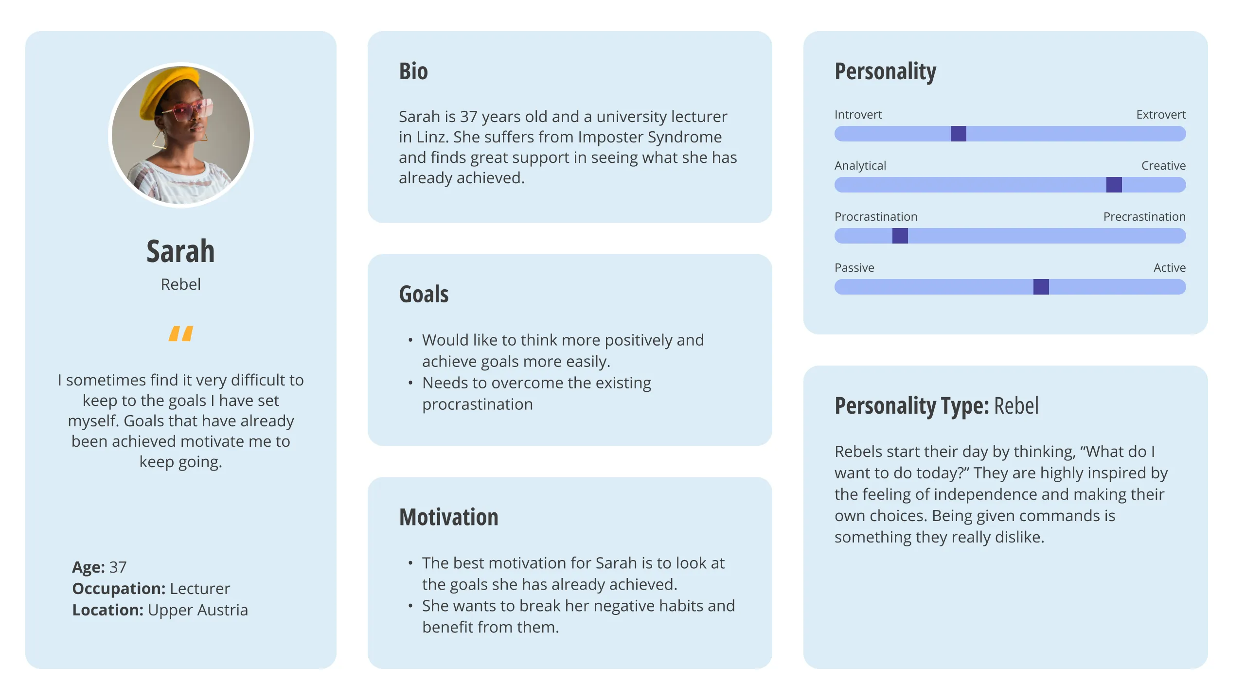
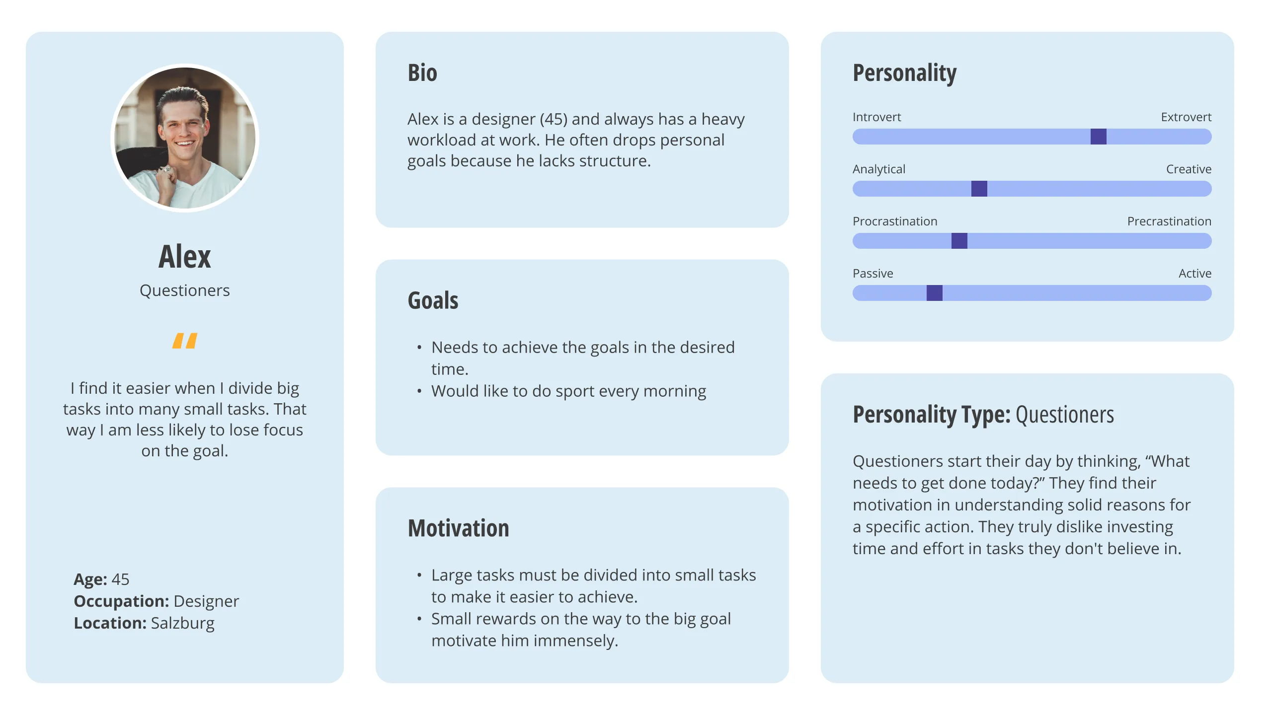
In terms of behavior, I could divide the participants into four basic groups:
- Upholders — Disciplined and respond to both internal and external expectations (6)
- Obligers — Can't keep commitments to themselves but respond to the expectations of others (10)
- Rebels — Hate being told what to do - so it must be something they want to do (4)
- Questioners — Ask a lot of questions and can keep a habit if they understand the logic and reasoning (1)
Personas
User Journey
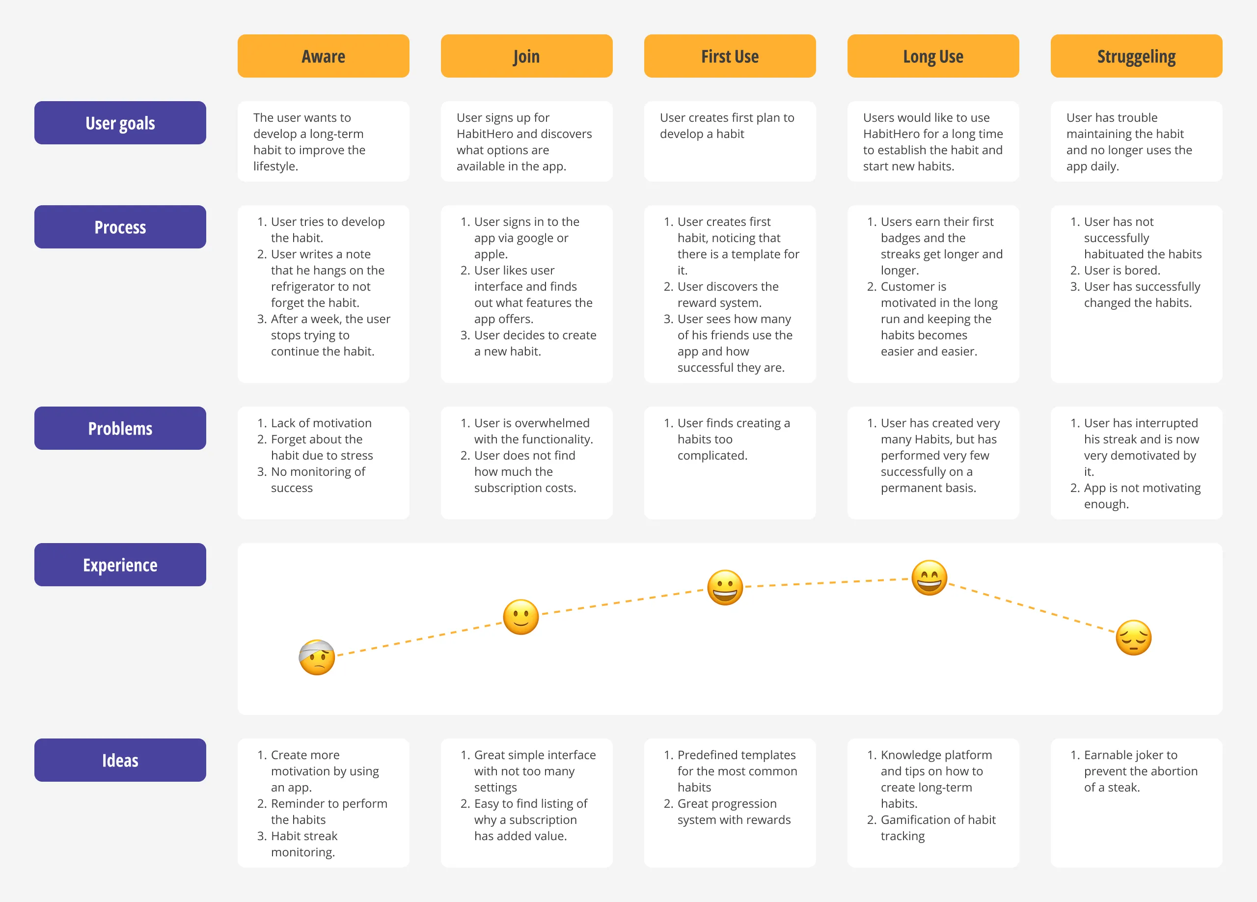
After the research, I created a user journey to identify opportunities for improvement and discover new pain points. I also wanted to make sure that my designer bias didn't have too much influence.
2. Define
I accumulated the information gathered during the empathize phase. Then I analyze my observations and synthesize them to define the core problems found. To do this, I first create problem statements and then value propositions.
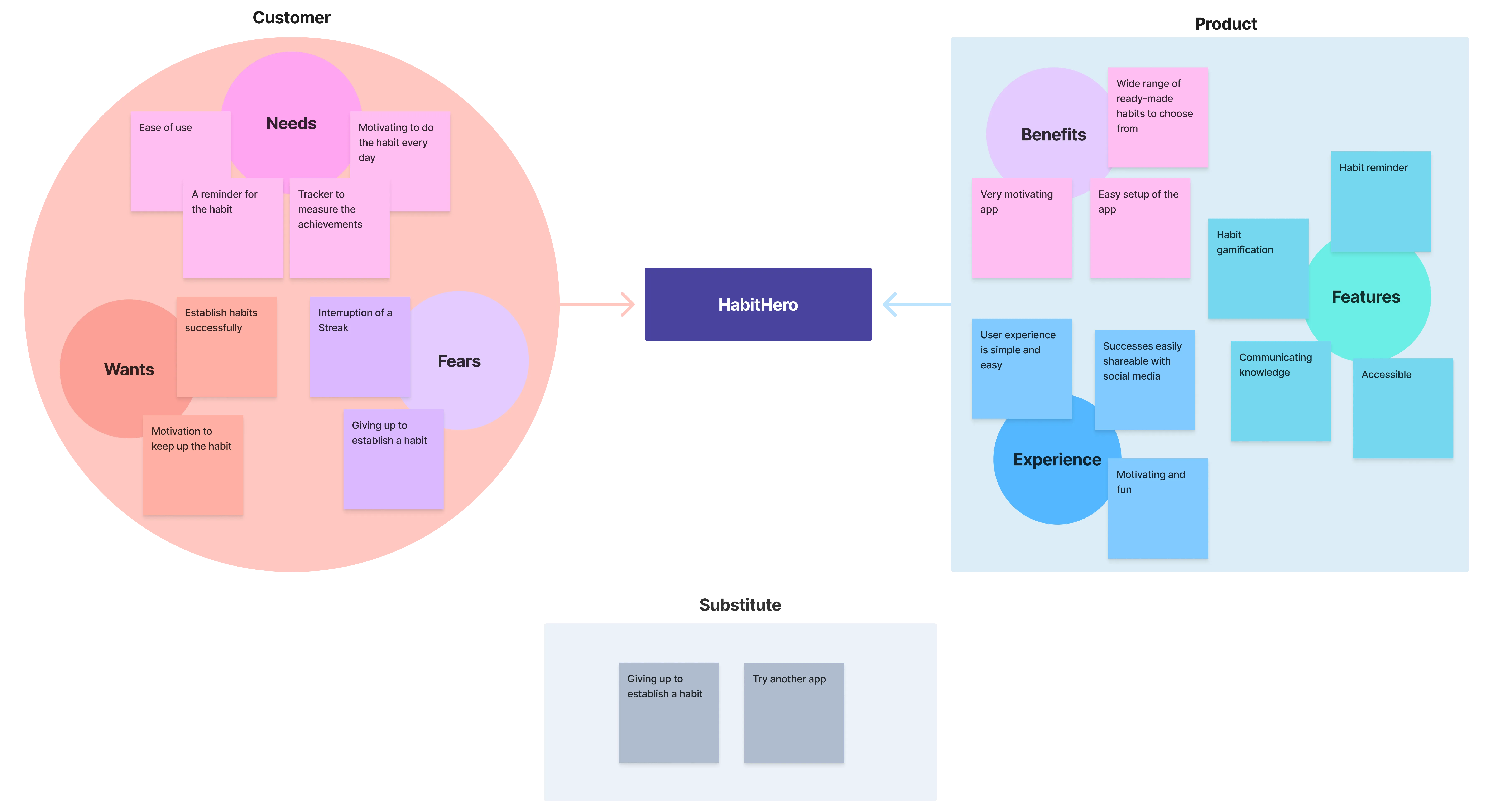
Value Proposition
Here I summarize why a consumer should use the product. It is important to put yourself in your user's mind. Users don't yet know your product or understand its value. That's where value propositions come in.
3. Ideate
Now that we have arrived at the ideate phase, we come to the most exciting part of the journey. Here, the task was to merge the data collected from the interview participants with the scientific data.
Competitive Audit
In this project, the competitive audit was very exciting, as it revealed the remarkable diversity in both the ideas and implementation across different products. Some apps were all about gamification (Habitica), others grew plants to progress (Avocation) and others took a very technical approach (Loop Habit Tracker) to meet the needs of the users. The user experience was excellent for almost all apps. I was also very happy that my vague idea did not appear among the competition and that I could fill a gap in the market.
Detailed competitive audit| Productive | Habitica | Daylio | Fabulous | |
|---|---|---|---|---|
| Business Size | medium | large | large | medium |
| Unique value proposition | Well-designed, good UI | Gamification in perfection in retro design | Very good UX with included mood tracker | Very nicely designed UI with the focus on habit routines |
| Features | Outstanding: Many features, Routines, Challanges | Good: Gamification, Rewards | Outstanding: Mood tracker, Rewards, Challanges | Good: Routines, Rewards |
| Price | $$$ | $-$$$ (Microtransactions) | $ | $$$ |
| Tone | Friendly and direct | Playful and direct | Friendly and direct | Friendly and direct |
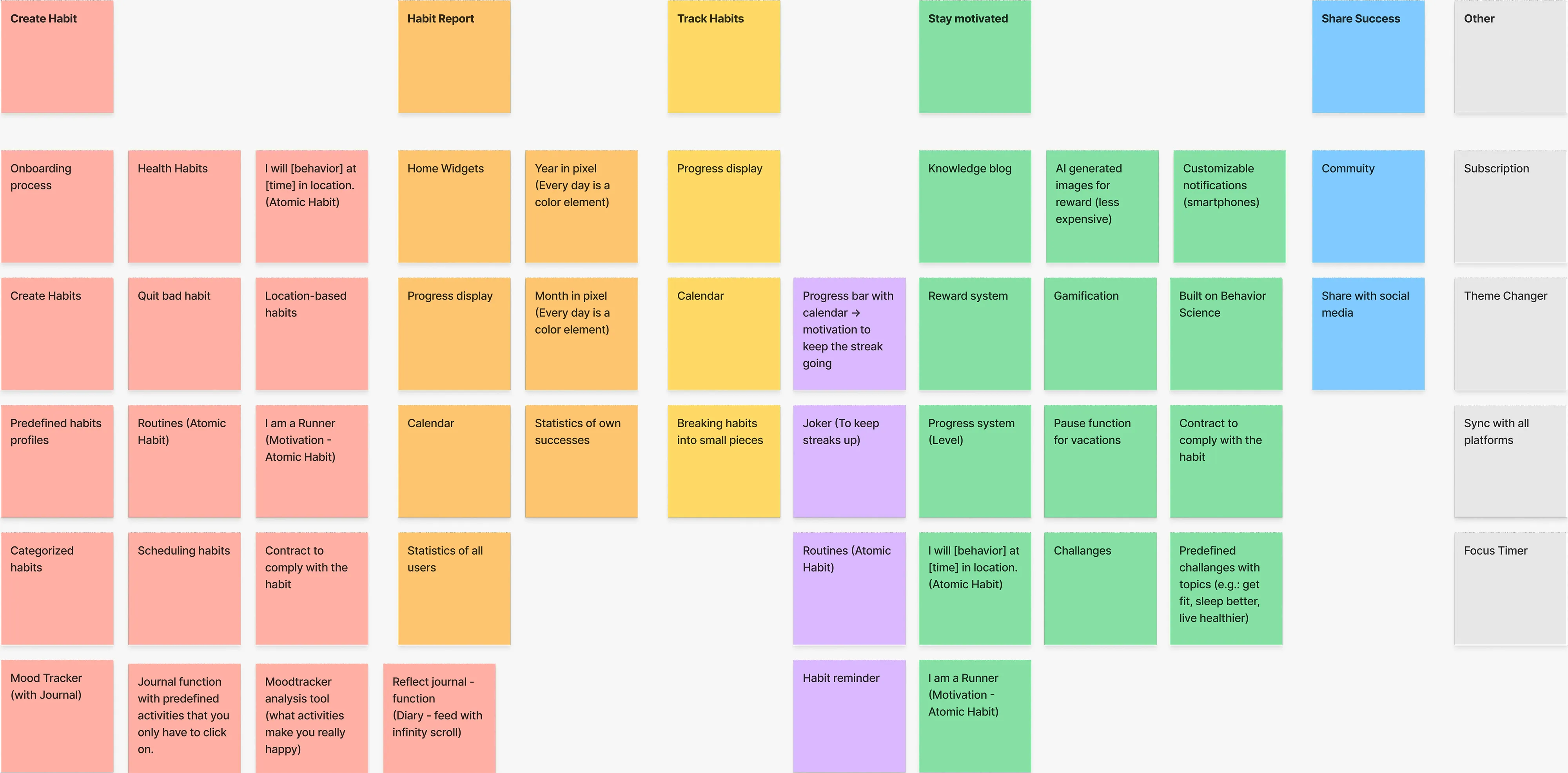
Affinity Map
It was very important to me that HabitHero take a scientific approach without being too complicated. Such an approach should not be a barrier to quickly and intuitively using and understanding the app. Two points from James Clear's book "Atomic Habits" stuck in my mind that I wanted to implement in the app.
- Habit stacking can also be thought of as routines. People find it easier to adopt a new habit when it is integrated into routines.
- Goals vs. System: It's not the goal that gets you there, it's how you get there. That's why I had in mind a gamification approach with a storytelling element that would motivate users to continue the adventure.
4. Prototype
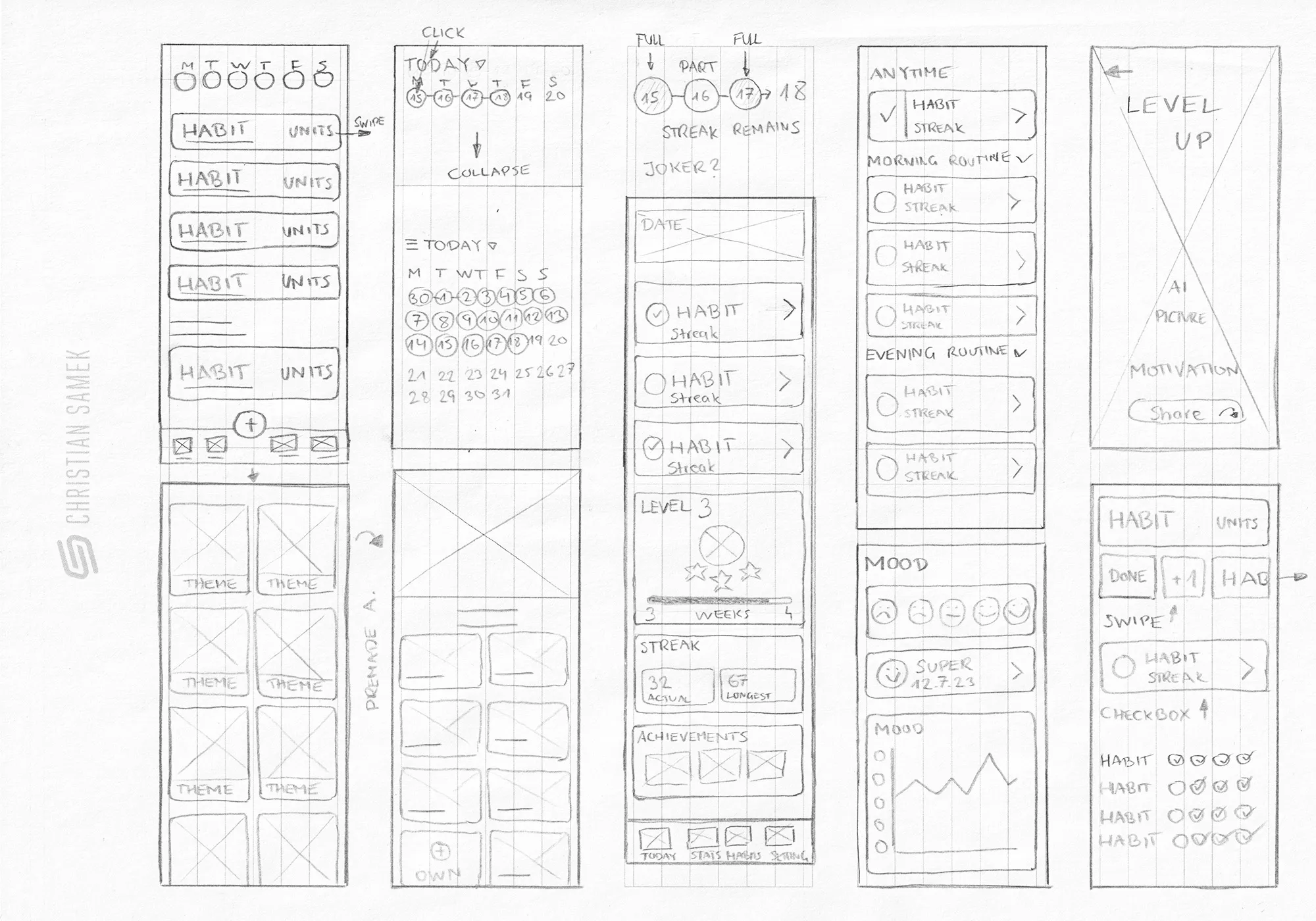
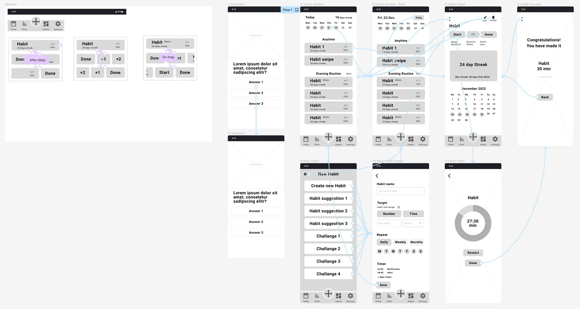
After the exciting ideation phase, the next step was to create a prototype. Here I followed the approach of first making a paper wireframe and then a low-fidelity digital prototype, which would then serve as the basis for testing.
Paper Wireframes
Digital Prototype
I decided to use an onboarding process to make it easier for users to set up a new habit. Users could then start the habit and set a timer. When the habit was completed, a splash screen would appear congratulating the user. Unfortunately, I forgot to include gamification here.
5. Test
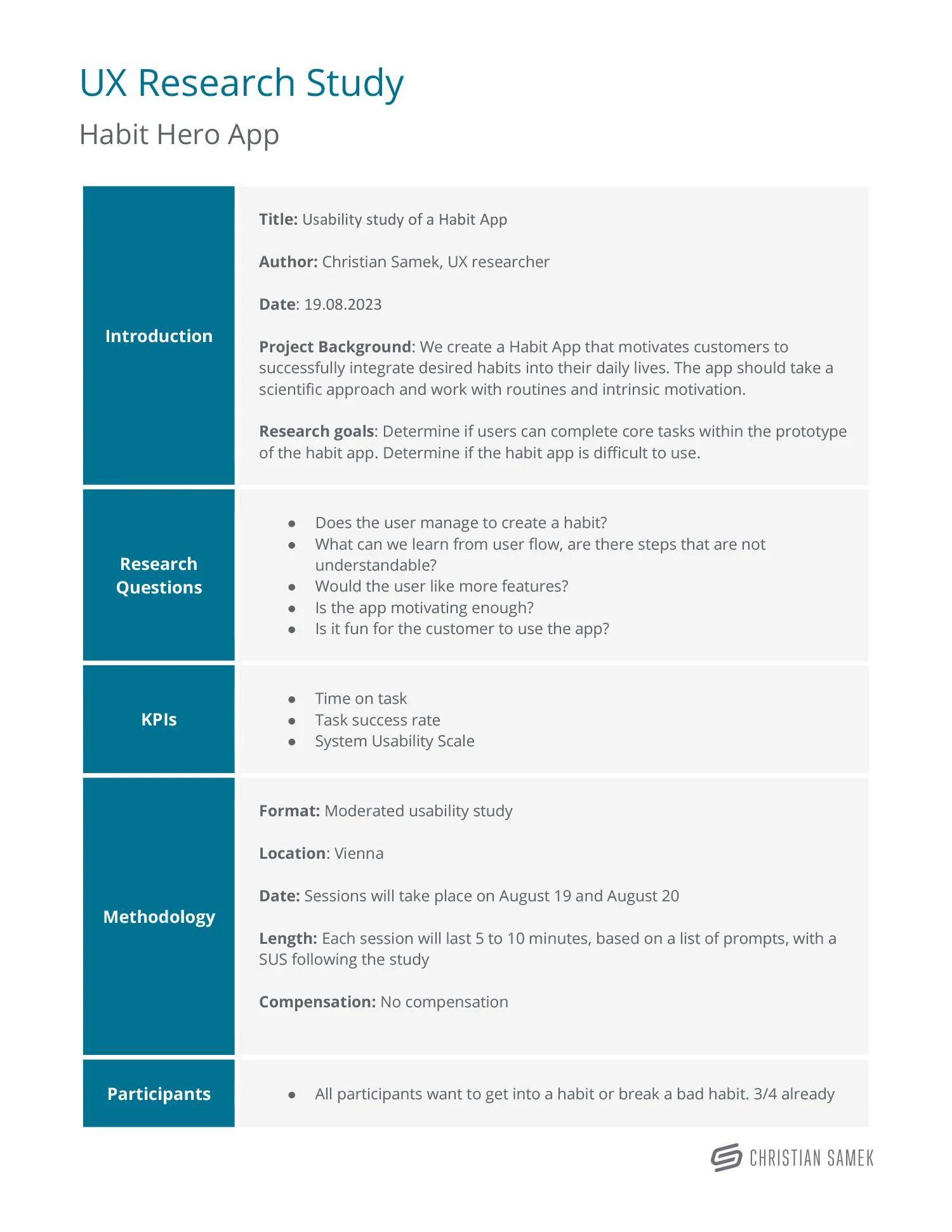
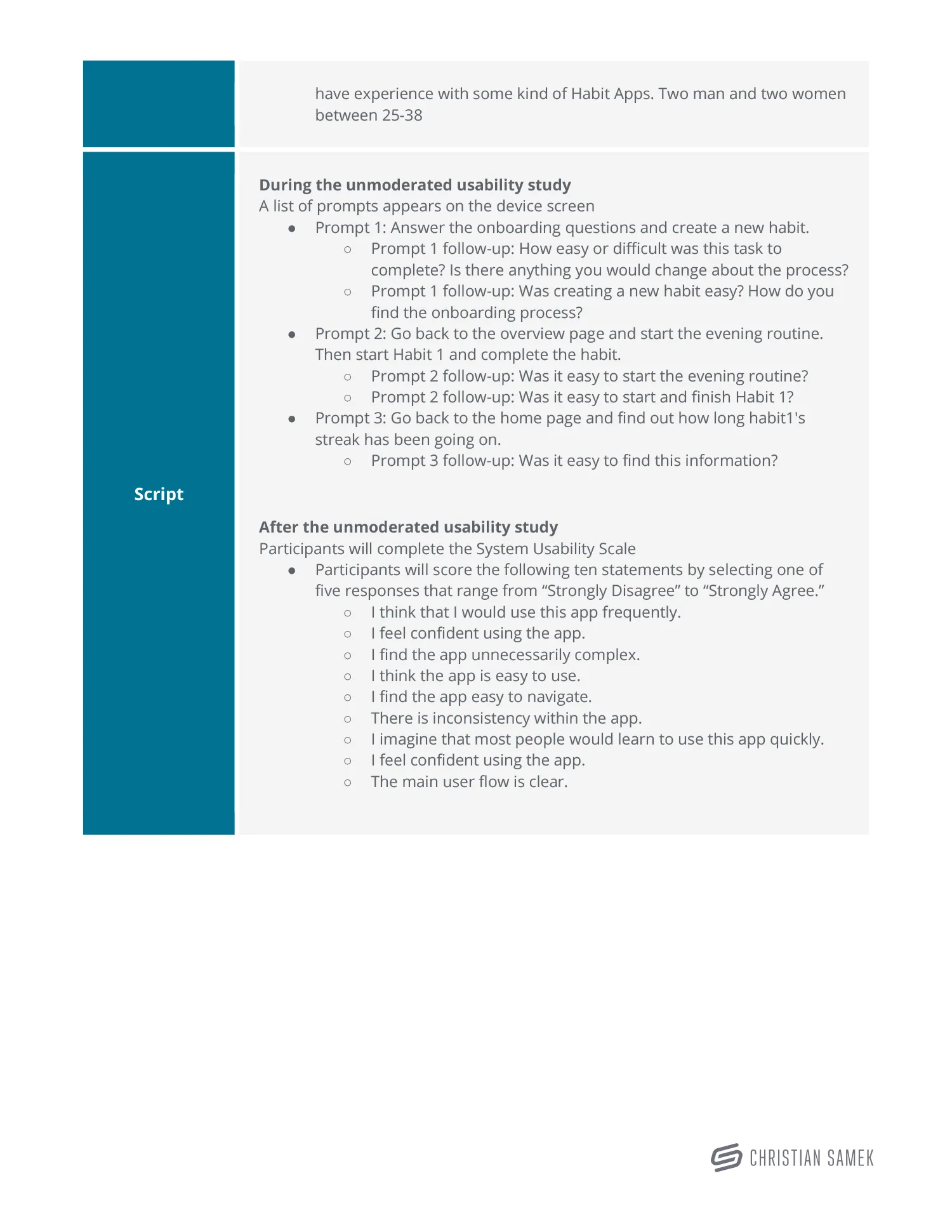
Now it was about discovering whether the participants find the app easy to understand and the functions easy to comprehend. For this, I conducted a usability test that led to a lot of conclusions.
UX Research Study
Affinity Diagram
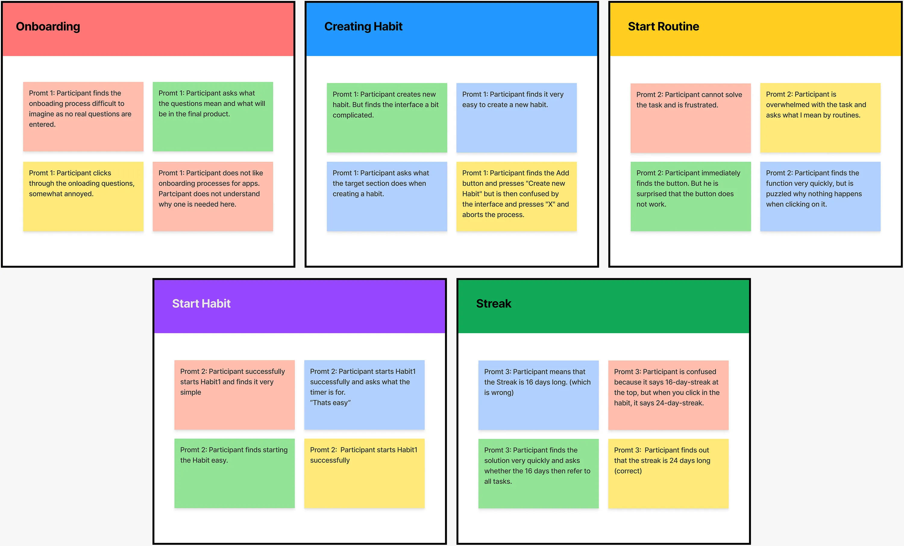
Now it was time to synthesize and organize the data into groups with common themes or relationships. The following five themes were identified.
Pattern Identification
- It was observed that 3 out of 4 participants are upset about the initial questions. This means that we need a button for skipping the questions or remove the questions at all.
- It was observed that 3 out of 4 participants find creating a habit complicated. This means that that the creation of apps must be made much easier.
- It was observed that 2 out of 4 participants could not find the routine function. This means that this function should be better integrated.
- It was observed that 4 out of 4 participants were able to successfully launch a Habit. This means that no significant improvement was necessary here.
- It was observed that 3 out of 4 participants found it difficult to see how long the streak has lasted. This means that the view for streaks needs to be improved.
Improvements
This usability study was very valuable to me because it revealed many problems. The feedback was quite negative and showed that the app design confused users. I realized that I needed to spend more time on this. I decided to simplify the application by removing some features, such as onboarding and habit timer.
6. Prototype
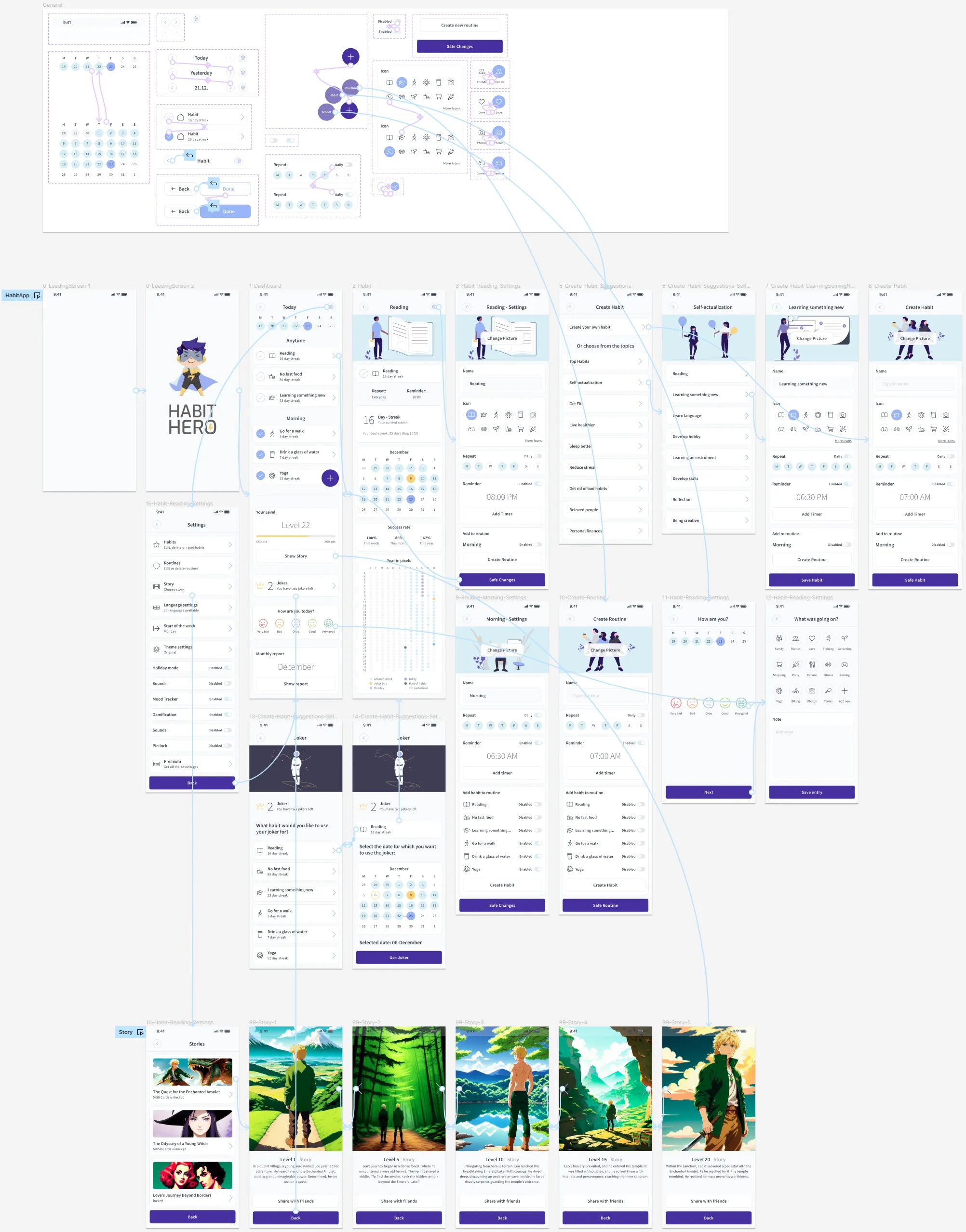
Now it was time for me to use all the knowledge gained from the usability tests to create a high-fidelity prototype that would meet the needs of the users.
High Fidelity Prototype
Storytelling with AI
Often, not much time is spent on the gamification of apps which results in half-hearted solutions. I didn't want to go down that path with this app. It is very important to make it clear to the stakeholders what the product could look like in the end. But, especially at this stage of development, you don't want to unnecessarily waste resources on having pictures made by hand for the prototype. So, there were two remaining options: buy finished images or use AI to generate the images. I quickly realized that the first option would not lead to the desired result.
The first part was to come up with story ideas that would engage and motivate the widest possible audience. Then I had a story written using ChatGPT that could be easily broken into small parts. This was done very quickly.
To generate the images, I used a version of the open source software called Stable Diffusion running locally on my computer. Stable Diffusion gives you much more freedom and possibilities to generate images than DALL-E or Midjourney and delivers equally good or sometimes even better results.
The goal was to create images with a very similar style and look. However, it was important to find a good compromise between quality and price (time). The end results were impressive yet affordable.
These are images for a prototype and a case study, not for the finished product.
7. Key results
It was an exciting process with lows and highs. The low-fidelity prototype was a bit of a low point in this project because, in retrospect, I didn't give it enough priority. The usability tests clearly revealed the weaknesses and helped me to create a great product. After investing a lot more time, I now believe the project is a complete success because I was able to merge the needs of users and the science of habits. The result is an app that has a great niche in the highly competitive habit app market. Especially the inclusion of the AI written story and the creation of the corresponding images with Stable Diffusion were a complete success, as they saved an incredible amount of time and would be an absolute eye-catcher for a presentation in front of stake holders.
More Projects
Web-to-Print Design-Tool
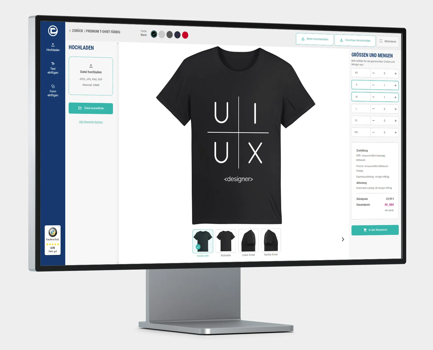
I am thrilled to present my project about an innovative web-to-print design tool that I have meticulously developed with passion and dedication. The primary goal, which was also achieved, was to develop a web-to-print solution able to readily compete with—and outperform—market leaders. For this, I had to think outside the box to find new solutions for old problems in order to create a great user experience.
View ProjectLunaHealth
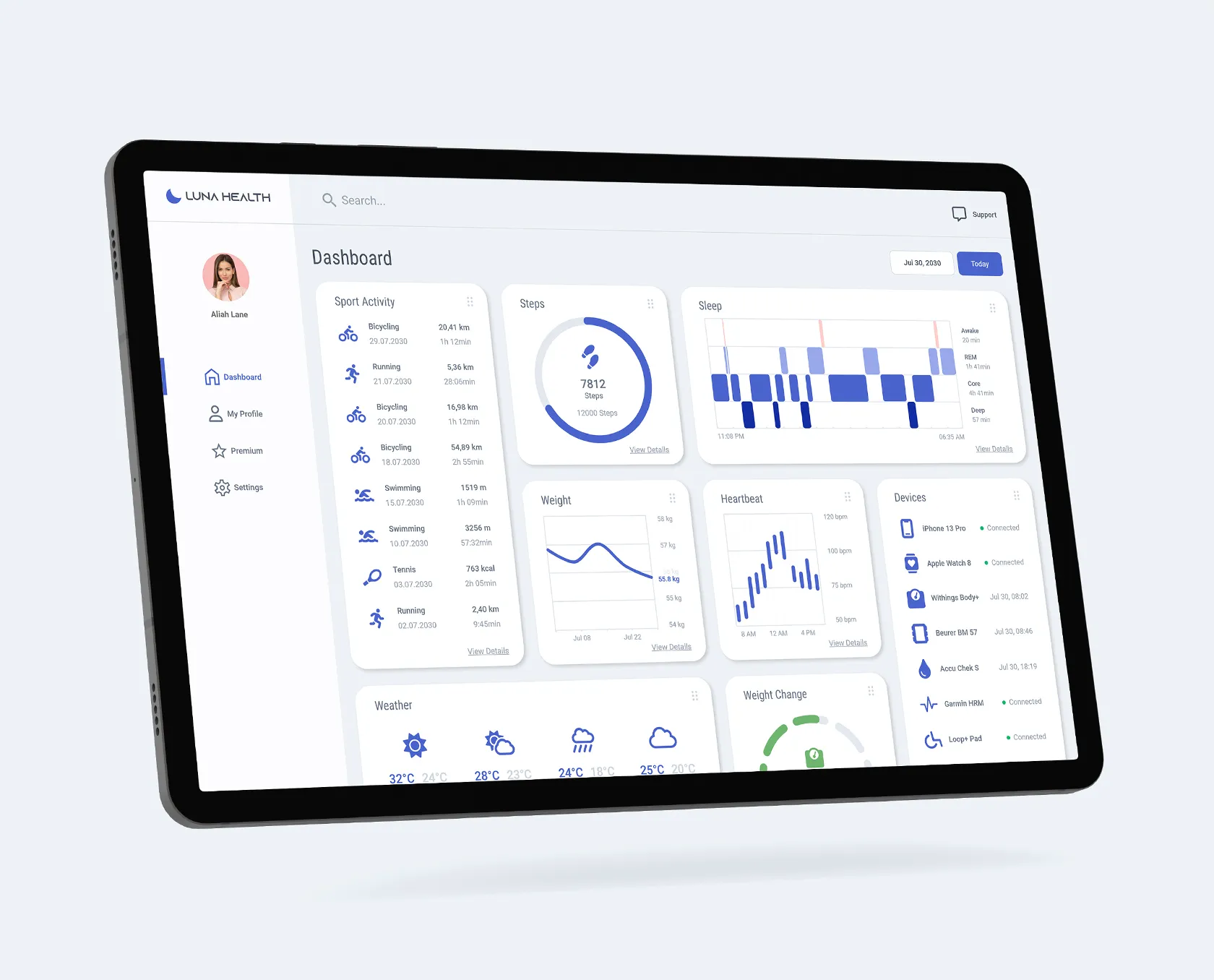
The project's primary objective was to create an inclusive web app for tracking health data in a user-friendly manner, especially focusing on people with disabilities who are often sidelined or even excluded from health apps. The solution resulted in a clean web app that catered to user needs, with detailed information accessible through tiles. The design process involved empathizing with various user groups through interviews, defining pain points, and creating personas. Competitive audits and research informed the ideation phase, leading to a high-fidelity prototype.
View ProjectCinemaDevine
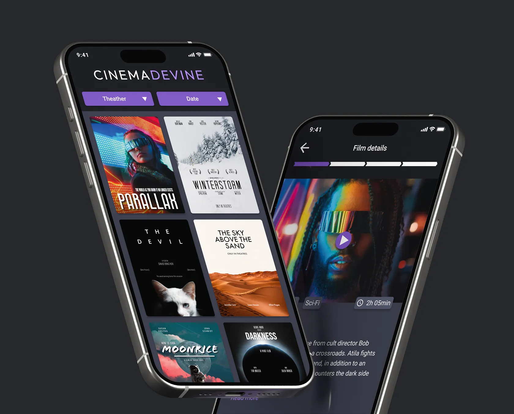
This was my first project for the Google Professional Certificate, where I applied the Design Thinking Framework to create an app for a fictitious cinema company called Cinema Devine. The goal was to understand users' needs and challenges to create a user-centric, data-driven, and uniquely branded app. I conducted interviews, created data-driven personas, problem statements, and a value proposition list. The ideation phase involved brainstorming, competitive audits, and user flow planning. I designed wireframes and prototypes, and in the testing phase, conducted a UX research study, identified insights, and made improvements.
View Project


